Sunday 14 August 2011

Independent Study for Week 5 Studio


The poster above was selected due to its simple structure that makes use of white space and configured images for effective readability.

Layout - Black text in white space always work and is introduced first to the audience allowing the reader to understand the context before moving on to images. Coloured images have been cropped to exact size of the heading text for better transition.
Proportion - Enough text and white space is used to not overpower the strong images and dark colours.
Font - XL text used for main heading followed by L text for important statement highlighting her achievement. Small text used for the rest of the text. Sequential stages in sizes used. Sans Serif font used for better readability.
Colour - Black and white colours used with coloured images for contrasting effect.

Image Credits;

http://yvona.wordpress.com/2008/10/30/magazine-layout/zaha-hadid/, accessed  18th August 2011


DRAFT POSTER LAYOUT


Thursday 11 August 2011

Wk4 Studio Outputs

REFLECTION

The project so far is coming together nicely. The development of ideas, creatures, dwellings and terrain are all in line to what I have envisioned with reflection to my selected architect  Zaha Hadid.

Highlights of design process;

Folded Paper - An arduous task due to its nature of folding to create architecture that represent somewhat Hadid's work was almost impossible. I eventually looked at what I have experienced with folding paper and then worked around it, creating something close to the architect's design such as the 'Vitra Fire Station' with its sharp lines and contrasting awning and it worked....I think!
Creatures - In developing the creatures, I first looked at the possible environments that creatures could or would thrive in and then use Hadid's work to inspire a creature.
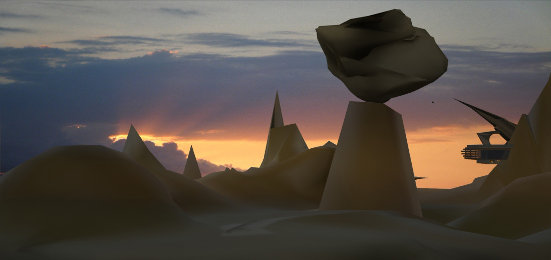
Environments - Ideas of the terrain came from the narrative of the creatures; Scaley thriving in hot and arid environment = desert or grand canyon, Slugger = Amazon or tropical areas. Simple sketches were created to bring forth the desired landscape that is surreal in retrospect to Hadid's work.
Dwelling - Minor changes with mostly additions to living spaces and comfort were made upon receiving advise from Matt (Tutor). As the folded paper already represented a passable dwelling in its own form, all is needed was to modify spaces uniquely inline to Hadid's work.
Major Change - There is however one change that I needed to make which I did not foresee after speaking to Matt. Upon developing the digital landscape on 3ds max, I found that scaleys world would better fit with Slugger's dwelling. Hence I have decided to swap the dwellings between the two clients.
AR/Markers - Dwelling works but have not tried animation yet, and require 2 more markers which I have not yet decided upon.

Wk4 Independent Study Outputs


The following video gave me inspiration of how Augmented Reality Systems can be used with a number of applications such as an Auto-mechanical trade you see above. The thought that anyone off the street can be taught these skills without prior knowledge is amazing. Step-by-step visual aides guide you to build, repair and resolve issues that only professionals in their field can provide. In the built environment, this application can be an invaluable source of visual representation and collaboration between trades with the added ability of client interactivity.


Wk3 Studio Outputs


Slugger's Terrain


Scaley's Terrain


    Wk3 Independent Study Outputs

    SCALEY


    Plans


    Sections
    Section A

    Section B


    DWELLING iMAGES


    Sunday 7 August 2011

    Wk3 Independent Study Outputs

    SLUGGER


    =


    Plans


    Sections
    Section A

    Section B


    Ventilation

    Cross openings have been included throughout the design process for better ventilation that will allow the removal of stale air containing water vapor, carbon dioxide and mould spores.